Works
Works
From concept to launch — projects that helped startups grow, scale, and stand out.

Into Design
Into Design needed to translate their mission of merging creativity with advanced technology into a cohesive brand. I designed a strategic visual identity that communicates their process of crafting innovative, human-centered solutions that redefine everyday experiences.
Branding
Into Design
Into Design needed to translate their mission of merging creativity with advanced technology into a cohesive brand. I designed a strategic visual identity that communicates their process of crafting innovative, human-centered solutions that redefine everyday experiences.
Branding
Into Design
Into Design needed to translate their mission of merging creativity with advanced technology into a cohesive brand. I designed a strategic visual identity that communicates their process of crafting innovative, human-centered solutions that redefine everyday experiences.
Branding

Potti Kadai - Chai Kings
This project explores the design and development of a cost-efficient, portable, and sustainable F&B kiosk designed from cardboard for Chai Kings, a tea beverage company. The kiosk aims to prioritize user-friendly service, efficient assembly, and clear brand visibility while catering to diverse customer needs.
Product
UX
Branding

The Daily Refill
The Daily Refill aimed to redefine the Indian grocery experience with a focus on sustainability. I designed them a clean and approachable brand identity that tells the story of their modern, conscious approach to buying groceries and stocking daily pantry essentials.
Branding
The Daily Refill
The Daily Refill aimed to redefine the Indian grocery experience with a focus on sustainability. I designed them a clean and approachable brand identity that tells the story of their modern, conscious approach to buying groceries and stocking daily pantry essentials.
Branding
The Daily Refill
The Daily Refill aimed to redefine the Indian grocery experience with a focus on sustainability. I designed them a clean and approachable brand identity that tells the story of their modern, conscious approach to buying groceries and stocking daily pantry essentials.
Branding

Mana Living
Mana Living needed a unified brand identity to attract high-end, luxury clients and stand out in a competitive market. I designed a sophisticated brand identity, centered on a logo that tells their four-step story, to position them as the premier partner for bespoke, stress-free project execution.
Branding

The Divine LA
The Divine Landscape Architects approached me to translate their philosophy of creating 'soulful spaces' into a cohesive brand identity. To capture their unique ethos of 'grounded divinity,' I developed a visual system that harmonizes the fluidity of organic forms with the discipline of architectural precision.
Branding
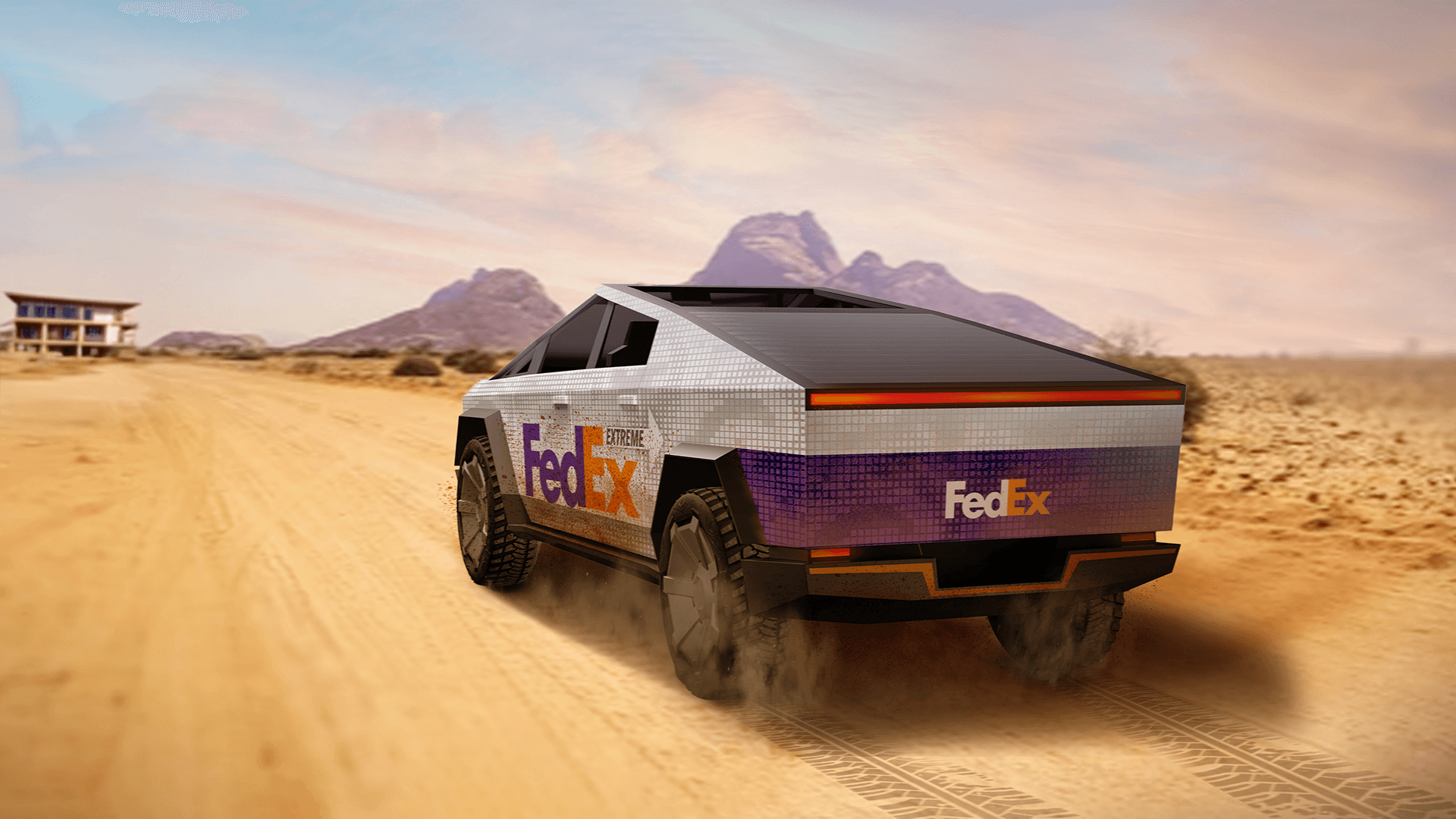
FedExtreme
This project explores a vehicle graphics for the FedEx Cybertruck, an off-road, electric delivery vehicle introduced under FedEx’s Technology and Innovation Policy to handle extreme terrains. I designed a graphics that visually express the Cybertruck’s innovative nature and its capability to operate in challenging environments, while integrating FedEx’s branding.
Visual Design
Branding
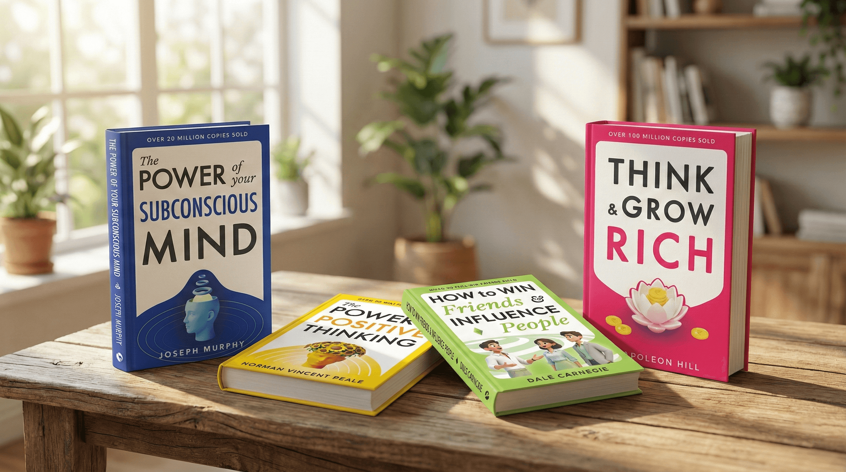
Self-Help Book Covers
Omni Books tasked me with reimagining their self-help series through a modern, inviting and a cohesive design language that aimed to lower the barrier for new readers and reach more people. I developed a modular design system ensuring visual consistency across the catalog, positioning the brand as a premier guide for personal growth.
Visual Design
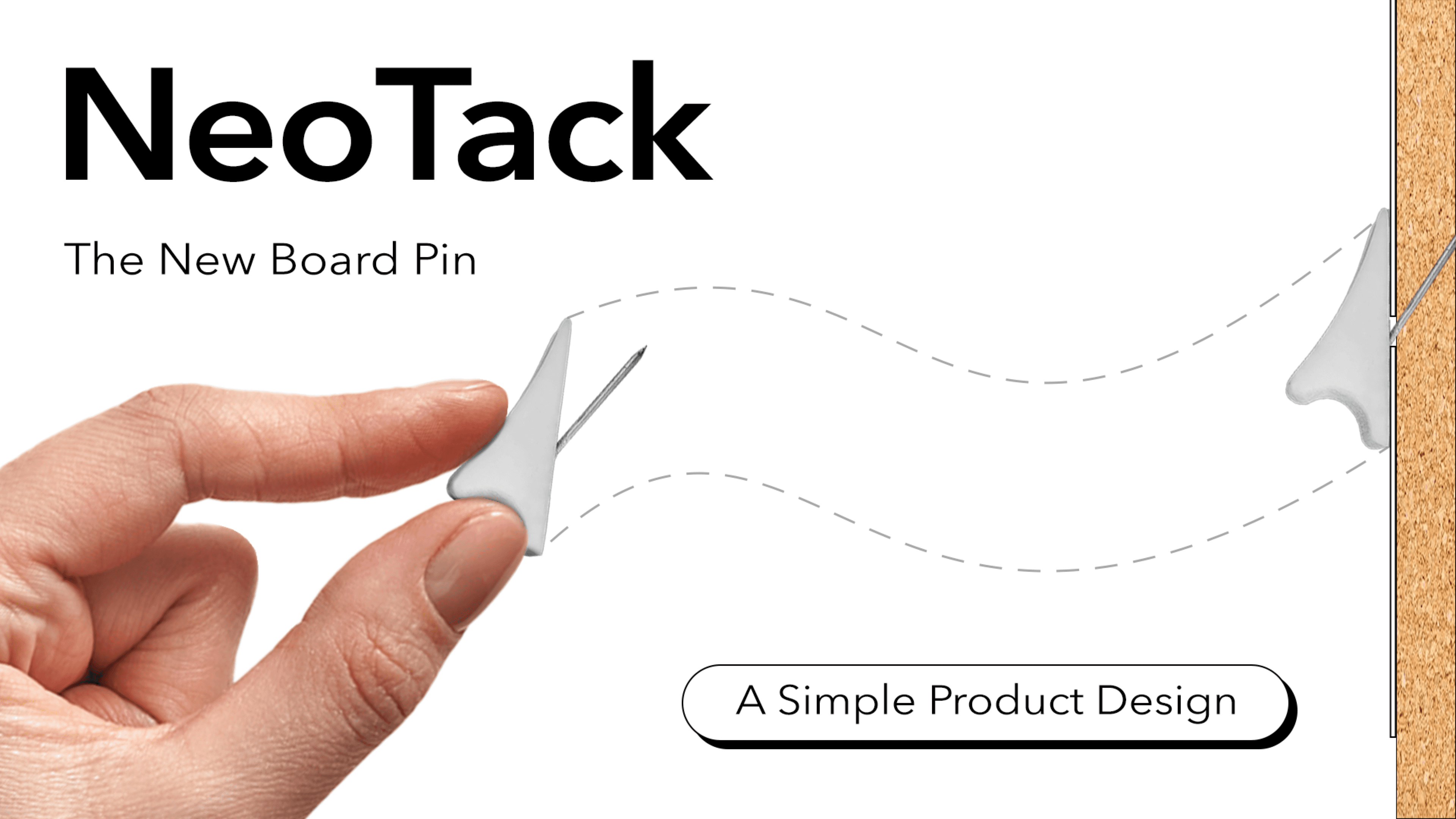
Neo Tack
This project, titled “NeoTack – The New Board Pin,” is a simple product design intervention that reimagines the everyday thumbtack to make it safer, more ergonomic, and less damaging to paper. The core aim is to minimize holes, tears, and creases in pinned sheets while improving grip, stability, and ease of use for a wide range of users.
Product

Typeface - into sans
Evolving from a custom logotype for Into Design, I developed this bold, lowercase typeface after falling in love with the original style that emerged during the branding process. Built on a modular grid with 45° chamfers, the design prioritizes a high-impact visual rhythm that transforms letters into unique, structural silhouettes for contemporary identity projects.
Visual Design
Ready to build something amazing?
I'd love to connect with you!
Ready to build something amazing?
I'd love to connect with you!
Ready to build something amazing?
I'd love to connect with you!